
Hands up - who's ever bought a bottle of wine because of its label rather than reading its flavour description?
That'll be most of us, then. But beer used to be a slightly different matter, traditionally using just the brewery's name and logo to help sell bottles without a huge amount of thought invested in label design.
No longer. The surge in popularity of craft beers has ensured that the way our brews look is now as important as the way they taste. Scanning the beer aisle nowadays will yield a new crop of labels even more design-led than their wine or spirit stablemates, but if it appears that stand-out appeal alone is at the top of the priority list then think again.
In celebration of the beautiful beer label, we've rounded up 20 of the best designs from indie Scottish breweries - see below.
Matthew Robinson, design director at creative design agency Tayburn, explains why when it comes to beer label design, branding is more than just a pretty face...
"Tayburn deals in brands - the name, the visual appeal, the personality and emotional appeal behind the product. Designing a new brand in a crowded category (and the beer category is bursting at the seams) means having to understand customers' behaviours and disrupting their shopping pattern - offering them something that breaks the conventions of the aisle they're shopping in.
"Then, beyond the shelf stand-out, we consider every part of the shopper's relationship with the product once it's in their hands; the name, the language, the visual style, the attitude... these are the bits we play with to build the personality of the brand and make it memorable.
"Besides breaking the norm and creating stand-out, designing for a beer brand comes with some challenges. The most important brand assets - the name, the visual appeal, the personality and emotional appeal - have to fit into a pretty small space (the label.) So, while some brands try to add in every description, detail and visual cue possible, Tayburn tries to strip out every unnecessary detail until all that remains is a simple, iconic and easily memorable piece of packaging.
"Tayburn has a strict briefing system - it's essential to the creative process. Our designers need a deep understanding of the history of the brand and the conventions of the category, so they know how to respond creatively - it helps set the scene. It also documents our client's commercial objectives, and other useful information taken from research and planning. A good brief will lay the groundwork and point you in the right direction. It's the designer's job to find the answer.
"It's a lot of fun thinking of radical, creative ideas when you design a beer brand, but the alcoholic drinks sector is governed quite heavily by The Portman Group, a body which ensures drinks brands follow a code of conduct and don't promote irresponsible drinking. So when we developed the Black Wolf brand and its portfolio of beers, we had to create a suite of beer names that fitted the brand's attitude, were liked by the client and kept The Portman Group happy. During the process we came up with over a hundred names to find five that satisfied all three criteria!"
So here's our 20 top designs from indie Scottish breweries. Have we missed any? Let us know by leaving a comment below along with your name and location.
 1. Onyx Black
Made by: Alechemy Brewing Ltd., Livingston
Label's strengths: Technically, all of Alechemy's beer labels could make the cut, but our favourite, the Onyx Black (pictured at the front left with multi-coloured label and black lid) just edges ahead. The Capital 'A' is pleasingly medieval-looking, while the striped colour effect has a stained glass window quality.
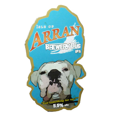 2. Brewery Dug IPA
Made by: Arran Brewery
Label's strengths: Brewery Dug - not to be confused with BrewDog - gives a nod to its homeland with the label's form (echoing Arran's shape). The rest of the label, however, represents the beer's flavour: an American-style IPA with 'attitude', as evidenced in Arran Brewery's boxer dog Helga demanding: 'got something tae say?". Definitely not...
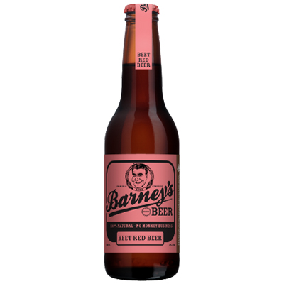 3. Beet Red beer
Made by: Barneys Beer, Edinburgh
Label's strengths: Nostalgic typefaces and a salmon pink colourway give Beet Red some stand-out appeal, while its crest - a grinning Barney - looks like a character straight out of Family Guy.
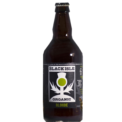 4. Blonde beer
Made by: Black Isle Brewing Company, Black Isle
Label's strengths: Use of monochrome with a spot of zingy green keeps the Blonde's label looking cool and pared-back, while the minimalist reimagining of the thistle is both a nod to its heritage and a modern twist. The organic sketching of the thistle keeps the design looking reassuringly hand-drawn.
 5. Big Red Ruby beer
Made by: Black Wolf Brewery, Stirling
Label's strengths: The Big Red's pictured wolf may be missing its head, but it's a nicely interpreted way of illustrating the beer's big "assertive" flavours. Modern fonts and a bold pink-red background also roots the Big Red firmly in the 21st Century.
 6. Tundra wheat beer
Made by: Black Wolf Brewery, Stirling
Label's strengths: Proving that each style in a series of beers can have its own clear identity, Black Wolf Brewery's Tundra wheat beer pours with a thick white head - as the snowy label helps to hint at.
 7. Black Jacques
Made by: BrewDog, Ellon
Label's strengths: BrewDog's Black Jacques is said to contain "twisted and complex" flavour combinations. It makes sense, then, that its label looks like something straight out of a nightmarish comic book.
 8. Snake Venom
Made by: Brewmeister, Banchory
Label's strengths: The chaps behind Brewmeister are self-styled 'beer scientists', and this offering - Snake Venom - is said to be the world's strongest beer at 67.5%. Its branding, complete with warning sticker, bile green background and ominous serpent, warns it's not one for the faint of heart.
 9. Swift pale ale
Made by: Deeside Brewery
Label's strengths: Sometimes, less really is more. Deeside's Swift feels slick and contemporary and the typefaces used hint at the American hops used to make it. The way its name appears from the black background wouldn't look out of a place in a movie promotion.
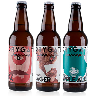 10. Outaspace Apple ale; Gladeye IPA; Bearface lager
Made by: Drygate Brewery, Glasgow
Label's strengths: Newly-launched brewery Drygate had these labels designed by Glasgow School of Art graduates Jack Bedford, Linda Sweenie and Andrew Park. The result is eye-catching colour and form balanced with keen illustrative details.
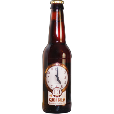 11. Clock Brew beer
Made by: The Eden Brewery, St Andrews
Label's strengths: The clock that appears on the Eden Brewery's beer also graces the walls of the mill the brewery is housed in. It's a shape that's been married into the traditional 'keyhole' beer logo form, while gold and copper tones resonate a traditional vibe.
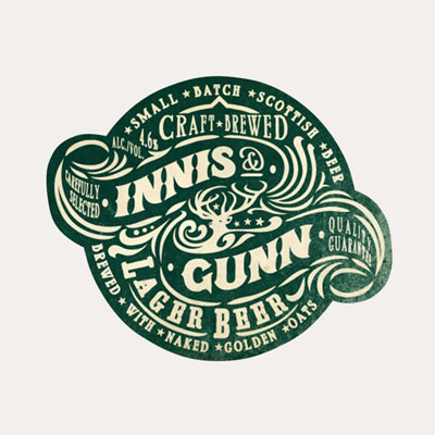 12. Lager beer
Made by: Innis & Gunn, Edinburgh
Label's strengths: Is it just coincidence that Innis & Gunn's Lager Beer bears more than a little resemblance to the nation's favourite golden syrup? The racing-green, faux-aged effect label complete with retro font gives a feeling of provenance and heritage.
 13. The West Highland Way ale
Made by: Loch Lomond Brewery, Alexandria
Label's strengths: The West Highland Way's label plays on the look of vintage transport and tourism posters. The pastoral scene and bright lime tones used reflects the ale's fruity notes and suitability as a refreshment to be enjoyed "after any walk no matter how long or short".
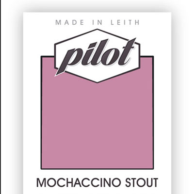 14. Mochaccino stout
Made by: Pilot, Edinburgh
Label's strengths: One of the country's newest breweries, Pilot, creates its range of stouts and ales from its plant in Leith. The Mochaccino stout's label combines simple graphics with a rich mauve shade. With Barneys and Black Wolf Brewery doing the same, is there a move towards newer beer labels employing colours historically perceived as 'feminine'?
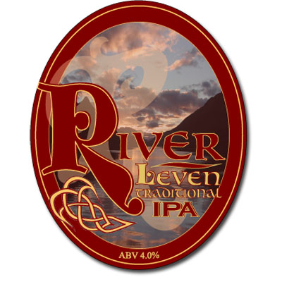 15. River Leven Traditional IPA
Made by: River Leven Ales
Label's strengths: Clue's in the title: this is one for the traditionalists. Not everone's cup of tea (or pint of bitter) perhaps, but there's something nostalgically lovely about the branding of River Leven Ales' IPA. A classic ale reflected with an olde worlde design.
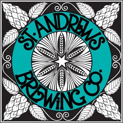 16. Crail Ale
Made by: St Andrews Brewing Company
Label's strengths: St Andrews Brewing Company collaborated with local artist and ceramicist Susan McGill to create a range of labels which differ slightly in colour depending on the style of beer. McGill herself lists tradition, grannies and heritage, among others, as her influences, and this design's kaleidoscopic qualities feel fresh.
 17. Cascadian East
Made by: Stewart Brewing, Edinburgh
Label's strengths: Stewart Brewing's collection of special bottlings is markedly different in design from the rest of its classic-looking output. Cascadian East, for example, uses on-trend typography paired with a clean design aesthetic, with just a hint of its heritage shown by a subtle stamp-effect image of Scotland.
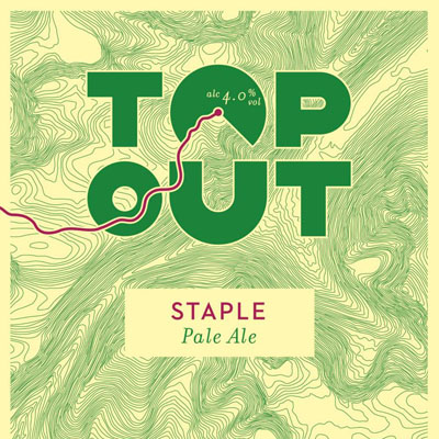 18. Staple pale ale
Made by: Top Out Brewery, Edinburgh
Label's strengths: As label designs go, Top Out's is up there. The contour lines provide an interesting background, while every other piece of information needed - percentage, beer name, beer type and so on - is imaginatively incorporated into the design itself. The result is a clutter free, classy looking thing of beauty.
 19. Skye Gold
Made by: Skye Brewery, Isle of Skye
Label's strengths: Skye Brewery's output recently received something of a makeover when businessman Kenny Webster stepped in last year to rehaul the branding. Nowadays, Skye's landscape is noted within the design, while classic fonts ensure the new label has a degree of longevity. The unusual diamond sticker shape creates a focal point, and its symmetry is visually pleasing, too.
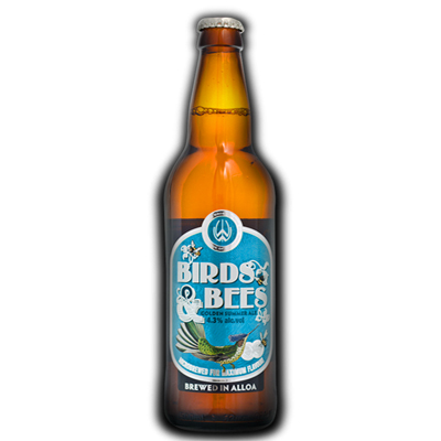 20. Birds & Bees ale
Made by: Williams Bros., Alloa
Label's strengths: Williams Bros. has a plethora of beautiful bottlings to pick from, but its Birds & Bees surely scoops the top spot when it comes to branding. Illustrative touches from... well... birds and bees sit harmoniously with a sky-blue background, and it's little wonder that Williams Bros claim the brew was made for "summer evenings".


Why are you making commenting on The Herald only available to subscribers?
It should have been a safe space for informed debate, somewhere for readers to discuss issues around the biggest stories of the day, but all too often the below the line comments on most websites have become bogged down by off-topic discussions and abuse.
heraldscotland.com is tackling this problem by allowing only subscribers to comment.
We are doing this to improve the experience for our loyal readers and we believe it will reduce the ability of trolls and troublemakers, who occasionally find their way onto our site, to abuse our journalists and readers. We also hope it will help the comments section fulfil its promise as a part of Scotland's conversation with itself.
We are lucky at The Herald. We are read by an informed, educated readership who can add their knowledge and insights to our stories.
That is invaluable.
We are making the subscriber-only change to support our valued readers, who tell us they don't want the site cluttered up with irrelevant comments, untruths and abuse.
In the past, the journalist’s job was to collect and distribute information to the audience. Technology means that readers can shape a discussion. We look forward to hearing from you on heraldscotland.com
Comments & Moderation
Readers’ comments: You are personally liable for the content of any comments you upload to this website, so please act responsibly. We do not pre-moderate or monitor readers’ comments appearing on our websites, but we do post-moderate in response to complaints we receive or otherwise when a potential problem comes to our attention. You can make a complaint by using the ‘report this post’ link . We may then apply our discretion under the user terms to amend or delete comments.
Post moderation is undertaken full-time 9am-6pm on weekdays, and on a part-time basis outwith those hours.
Read the rules hereComments are closed on this article