


A NEW visual identity for Rangers Football Club was revealed last night through images projected on to a series of Glasgow landmarks, including Kelvingrove Art Gallery and Museum and the SEC Armadillo.
The new look, designed by Kilmarnock-based creative agency See Saw, has been heralded as the most-marked change in the club’s crest and branding in more than 50 years.
The change was revealed as the club embarks on a programme of global expansion and fan engagement ahead of celebrations marking 150 years since Rangers Football Club was established.
Kelvingrove Park has special significance in the story of Rangers as it was the location where its founding fathers, Moses and Peter McNeil, Peter Campbell, William McBeath, and Tom Vallance, met in 1872.
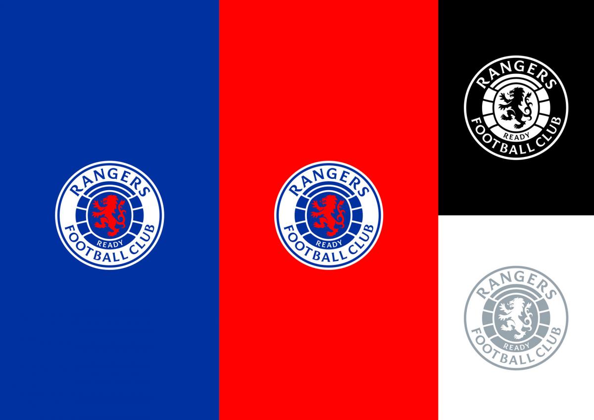
See Saw explained the new identity brings “the brand to life in today’s busy and noisy digital spaces” while retaining its core elements and styles. The Rangers name now sits at the top and centre of the crest, when previously it ran along the side, written in its own custom font.
The Ready crest was originally introduced in 1959 and is one of two official club crests.
Maurice Hynds, managing and creative director at See Saw, said: “The Rangers Ready crest has been designed to add balance, power and a stronger presence to the well-known Rangers brand. Incorporating a new visual language for use in the digital age, a new custom typeface and re-energised colour palate have been created for perfect clarity, no matter where they are applied.”
See Saw collaborated on the project with typographer and lifelong Rangers fan Craig Black, who created a custom typeface to capture the club’s heritage and character. It is envisaged that the typeface can be used on all aspects of Rangers branding, including social media, signage, and strips.
See Saw, founded by Cameron Syme with Mr Hynds in 2012, noted that the new typeface echoes the serif style of the bluebells on the gates at Ibrox Stadium. It also takes cues from the floor mosaic at the entrance to the main stand at Ibrox, and from various letterheads used throughout the years.
Mr Syme, managing and creative director, said: “We have retained, restored and re-energised the original visual elements in order to make a transformative impact whilst remaining true to the club’s brand values that encompass historic and pioneering elements.”
The new identity comes as the club launches a new website today. Designed by long-term partner Stadion, it aims to increase fan engagement and boost international growth and commercial performance through a new suite of digital products.
Stewart Robertson, managing director of Rangers, said: “As a leading European club, and in anticipation of our 150th anniversary year, it is important we adapt and continue to evolve.
"As we futureproof our business, a club brand evolution and digital strategy was a fundamental part of our long-term strategic plan and our commitment to be best in class both on and off the park.”


Why are you making commenting on The Herald only available to subscribers?
It should have been a safe space for informed debate, somewhere for readers to discuss issues around the biggest stories of the day, but all too often the below the line comments on most websites have become bogged down by off-topic discussions and abuse.
heraldscotland.com is tackling this problem by allowing only subscribers to comment.
We are doing this to improve the experience for our loyal readers and we believe it will reduce the ability of trolls and troublemakers, who occasionally find their way onto our site, to abuse our journalists and readers. We also hope it will help the comments section fulfil its promise as a part of Scotland's conversation with itself.
We are lucky at The Herald. We are read by an informed, educated readership who can add their knowledge and insights to our stories.
That is invaluable.
We are making the subscriber-only change to support our valued readers, who tell us they don't want the site cluttered up with irrelevant comments, untruths and abuse.
In the past, the journalist’s job was to collect and distribute information to the audience. Technology means that readers can shape a discussion. We look forward to hearing from you on heraldscotland.com
Comments & Moderation
Readers’ comments: You are personally liable for the content of any comments you upload to this website, so please act responsibly. We do not pre-moderate or monitor readers’ comments appearing on our websites, but we do post-moderate in response to complaints we receive or otherwise when a potential problem comes to our attention. You can make a complaint by using the ‘report this post’ link . We may then apply our discretion under the user terms to amend or delete comments.
Post moderation is undertaken full-time 9am-6pm on weekdays, and on a part-time basis outwith those hours.
Read the rules hereComments are closed on this article